Hi-key, lo-key, the histogram
When we make photos, we try to communicate our message. We
use direct information, usually in the content of the photo. But we also use
our visuals to communicate a mood. For this the lighting is very important. Vivian
posed for these photos. Thank you, Vivian. Vivian does make up for brides and
such, check out her page at: https://www.facebook.com/StyleCastleMalawi?ref=br_tf
When our story takes place at night we want to create the
mood of night, when our story takes place in the day we light like day.
 |
| 1 |
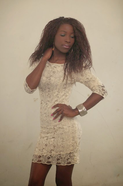
It is not simply a matter of making a photo darker. Photo 1
clearly shows that taking a bright photo with the camera set for dark, is not
the solution. This looks like a technical mistake, which is exactly what it is.
Here I set up model Vivian with a white dress against a white background, and I
underexposed by 3 stops. You see a white dress and white wall rendered in muddy
tones, and her face disappears in the darkness. Not good, and not a feeling of
night. This photo does not contain any whites, which usually results in a muddy
look, rather than a mysterious dark night feel.
For a photo that is set in, for instance, a nightclub, we
need to have large areas of dark tones, and small areas of light tones. We call
this low key, or lo-key. Most photos, but not all, benefit from having a full
range of tones from black to white.
When we make a photo that is supposed to look bright and
clear, we use a lot of bright tones, and small areas of dark tones. We call
this high key or hi-key. Again, most hi-key photos do benefit from small areas
of black, like most lo-key photos benefit from small areas of white.
 |
| 2 |
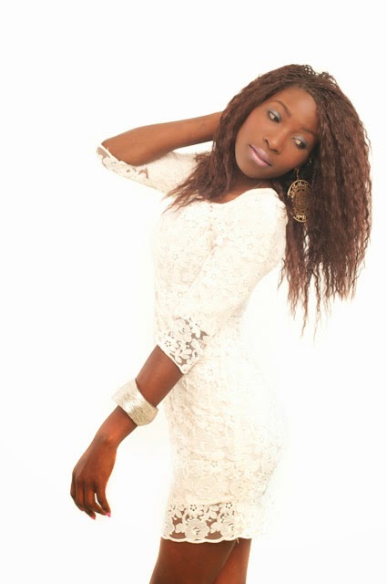
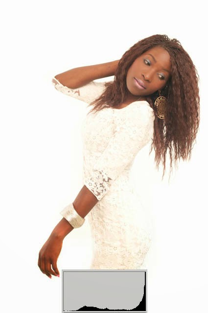
Let’s first look at the set up for a hi-key photo. For photo
2, I asked Vivian to wear white, and put her in front of a white background.
This poses interesting question of definition: you want to see the difference
between the white dress and the white background. For many hi-key photos a
light skinned model, often with blond hair is used, to create lots of light
tones. I worked with Vivian for both styles to show the difference, so there
are some darker areas of her hair and skin.
To make the background white, I added extra light. It
is not possible to light the background and the model the same and get a white
background without seriously overexposing the model. If you light them the
same, the background comes out grey or the model comes out overexposed. So left
and right behind her I put two flashes with umbrellas for even lighting, and
aimed them at the background, not at the model. Then I want the whole model to
be lit brightly. This is easiest with soft light from a large area, so I aimed
a flash at the white ceiling and wall behind the camera. That way I get soft frontal
lighting. By including the ceiling I made sure I created some soft shadows
under her chin, which gives modeling. If you want the photo shadowless, you
would place a large light above the lens and a large light below the lens. Or
you can place them left and right. Or just a large white area behind the camera
which you light brightly. Notice how you can just see the difference between
the white background and the white lace of the dress. Apart from the styling, hi-key lighting tends
to be comparatively simple.
 |
| 3 |
 |
| 4 |
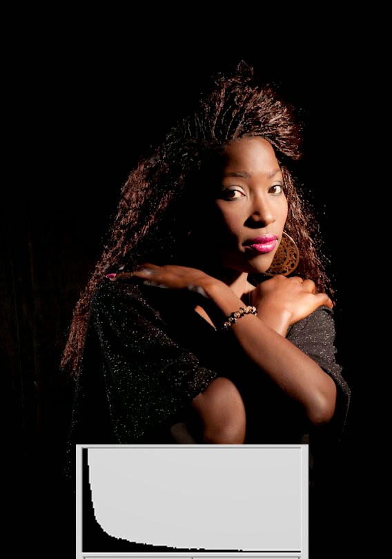
Lo-key lighting tends to be more complex: you have to use
light to create a feel of darkness. The styling can help, so for photo 3 I asked Vivian to
change to dark colours, and adjust her make up to a night feel. Then I placed
her in front of a black background. I started with one light, using a grid.
This gives a narrow bundle of light, that only lit her face and arms, I allowed
no light on the background or in the shadows. Note that the light areas in her
face are normally exposed, they are not darker than in the hi-key photo. But
the areas around it are dark, and that gives an interesting combination of the
feel of darkness, with a clearly defined face. On the left, her hair disappears
into the black background. Often we like to define the shape of the whole head.
The solution I chose in photo 4 was a second light to the left, almost behind the model. I flagged it, so it also gives a narrow bundle of light, and no light hits the background, or spills into my lens. If light that does not contribute to image spills into the lens it can cause lens flare which degrades the image quality. Note how the outline of the hair is defined, but there are large dark areas in the face and under her arms.
The solution I chose in photo 4 was a second light to the left, almost behind the model. I flagged it, so it also gives a narrow bundle of light, and no light hits the background, or spills into my lens. If light that does not contribute to image spills into the lens it can cause lens flare which degrades the image quality. Note how the outline of the hair is defined, but there are large dark areas in the face and under her arms.
 |
| 5 |
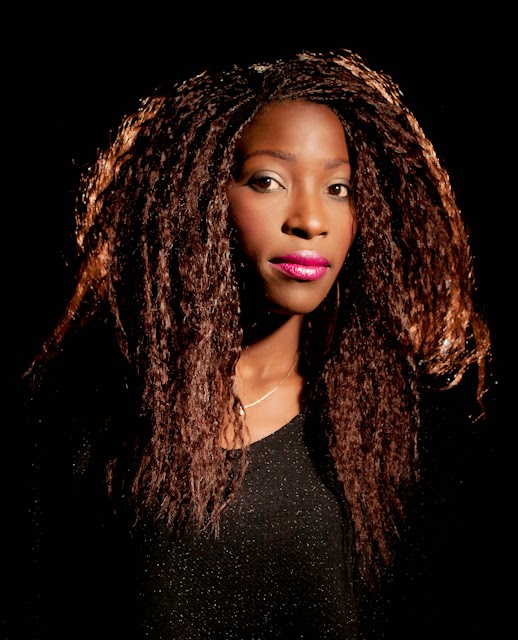
Another solution to outline the whole face is placing a
light behind the model, aiming straight into the hair. This works best with
fluffy hair (it is great for an afro!) so she changed her hairstyle for this
photo. See how only the outline of the hair is lit. Again large deep shadows
with no fill give a night time feel. (it was bright daylight in my studio when
we made these photos, I simply overpowered the daylight with my flash.)
When I do photos with off camera flash I usually set my
camera for manual exposure: the camera’s inbuilt meter does not know how much
flash is coming, so it cannot regulate the light correctly. Then I make test
exposures. On my lcd screen I can see how the light hits the subject. (when we
were working on film, we needed Polaroid photos to do this, which was expensive
and time consuming. Digital is much more user friendly) But the lcd screen is
not a reliable tool to judge exposure: when the light around us is bright, the
lcd screen looks faint, when the light around us is dark, the lcd screen looks
very bright. So it does not show
us correct exposure. For that, I use the
histogram. A histogram is a graphic rendition of the distribution of light and
dark tones. The dark tones are on the left, all the way on the left is black.
The bright tones are on the right, all the way on the right is white. The
middle tones are in the middle.
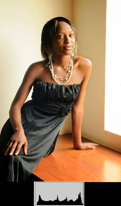
Look at this, more or less average lit, photo
6 of model Lucilia (thank you Lucilia). I put the histogram for this photo on the bottom. You see a more or less even distribution
of tones. The histogram shows some tones on the left, some tones in the middle,
and some tones on the right. This is medium key.
 |
| 6 |
 |
| 7 |
For a hi-key photograph, the histogram shows a lot of tones
on the right. These are the large bright
 |
| 8 |
areas. It shows few, but some, tones
on the left, these are the small dark areas.
To judge exposure from the histogram, you need to know if you are looking for
lo-key, and want a histogram with lots of tones on the left, or you are looking
for hi-key and want lots of tones on the right. This way the histogram can help
you get correct exposure with off camera flash. (The histogram is brought out
in different ways on different cameras, to find the correct button, consult
your camera manual. Some cheap point-and-shoot cameras do not feature the
histogram, and usually their flash features do not favour this kind of
equipment. For successful off camera flash, you need more advanced equipment)

No comments:
Post a Comment